
Sketches and Process
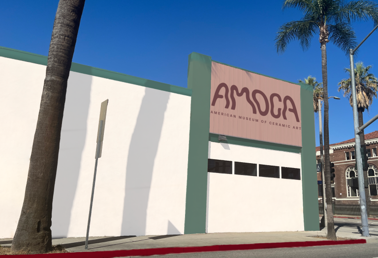
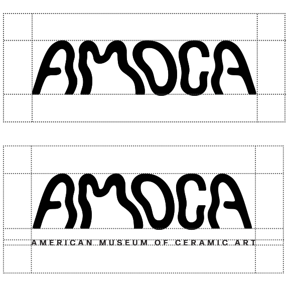
The logo was created using a grid that resembled a curved vase that is often seen in ceramics. This was done to show the moldability of clay and how it can be formed into anything as seen in the museum.
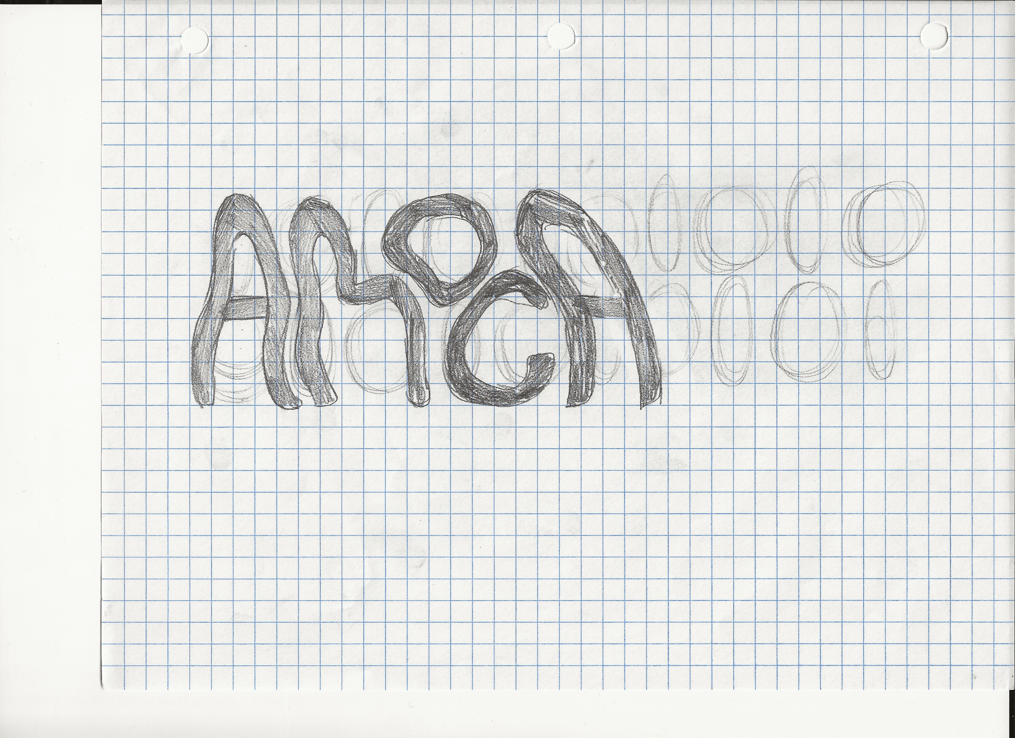
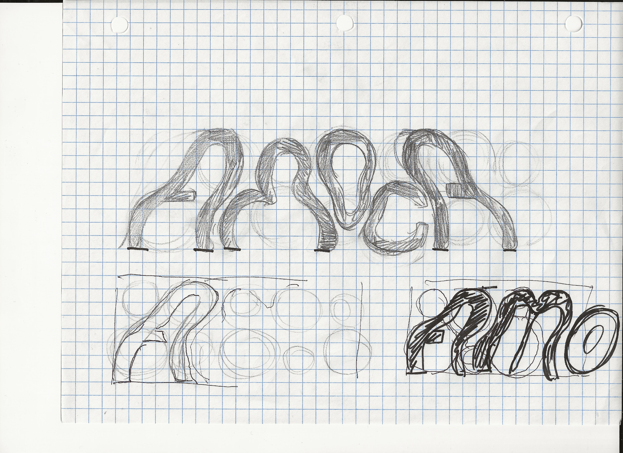
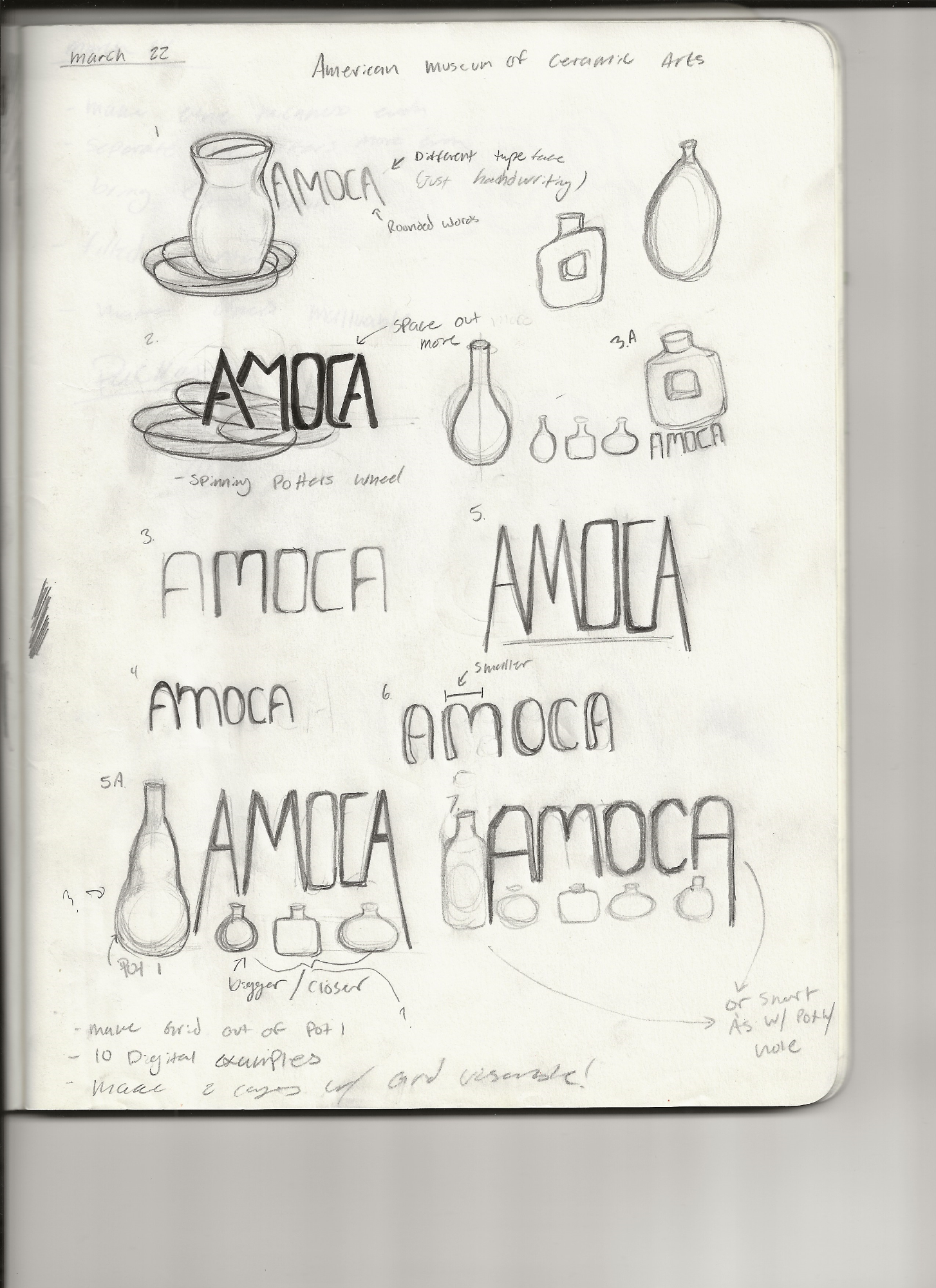
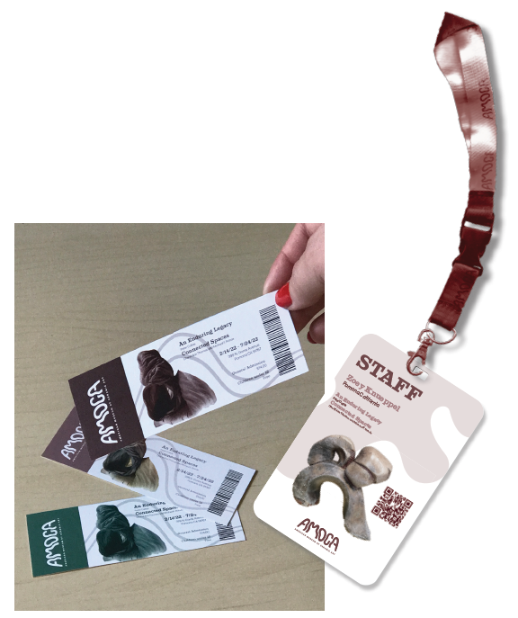
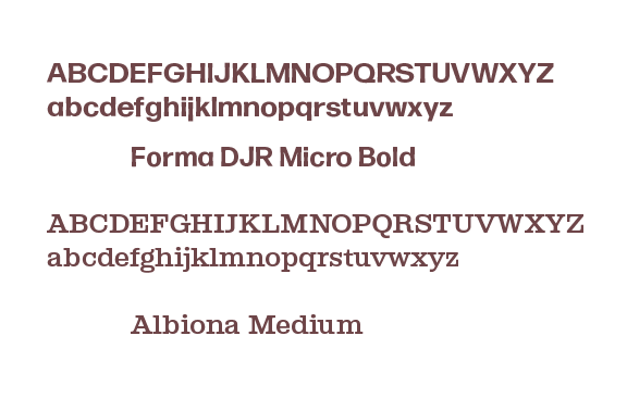
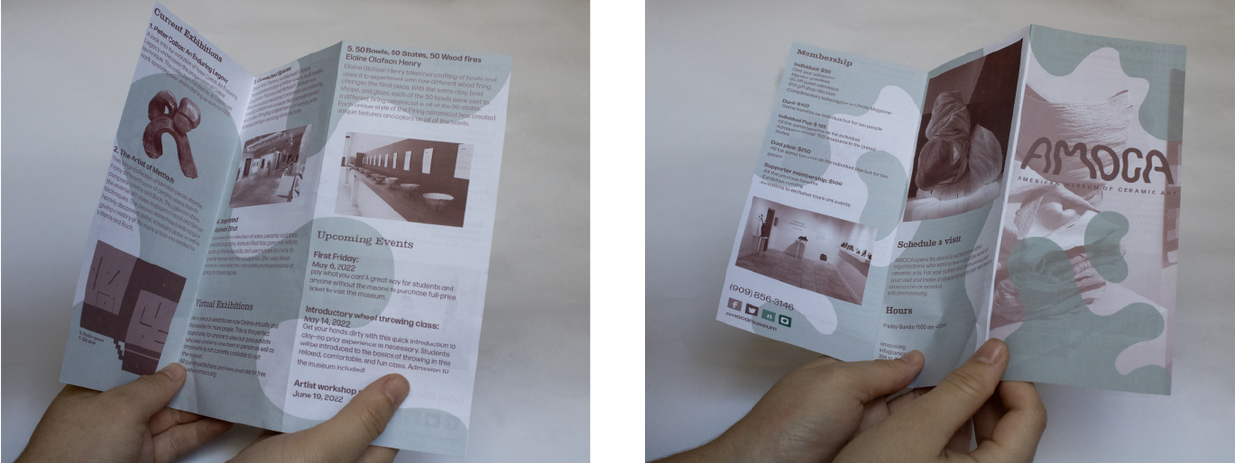
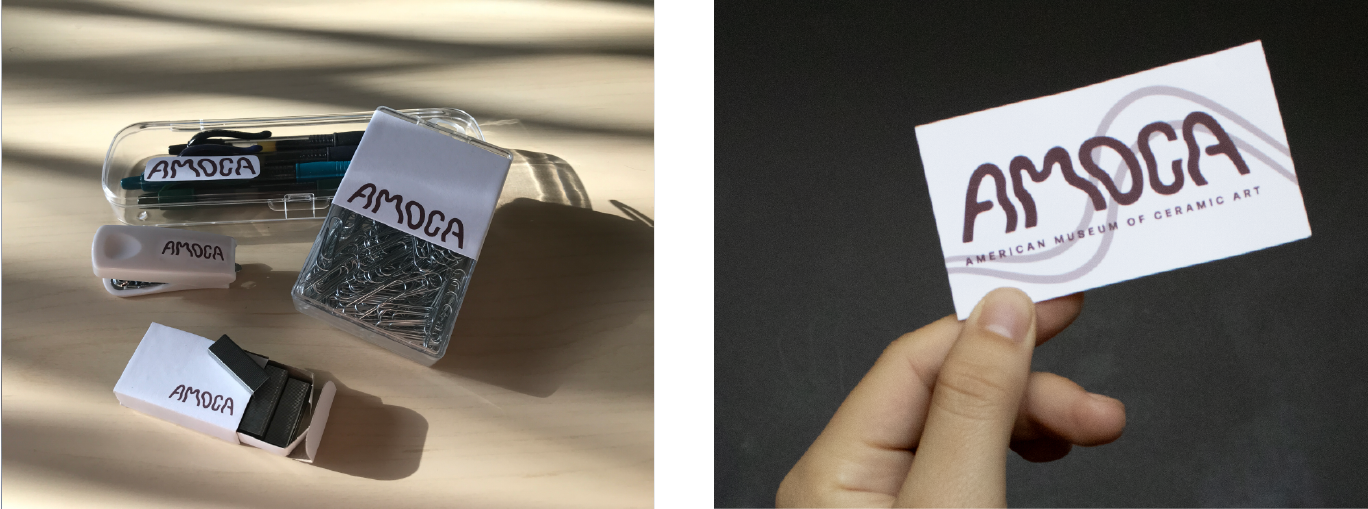
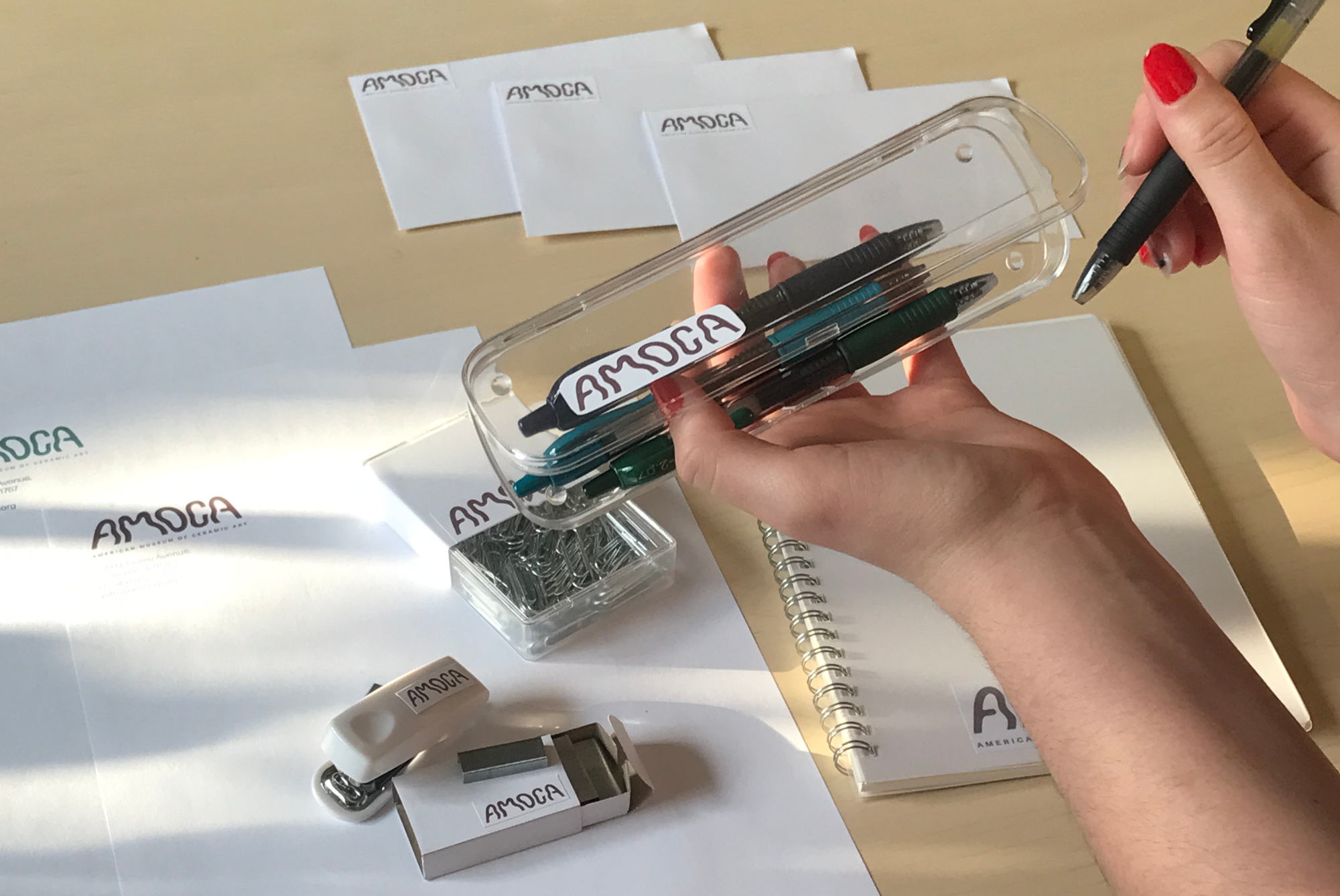
My goal with the new logo was to create a logotype that allows each letter to mesh together the way that clay would. Along with the logo, a brochure, tickets, staff event badge, and a full stationary package was created. There is a consistent motif of rounded shapes and lines that mimic the logo to give a molded feel to each item.
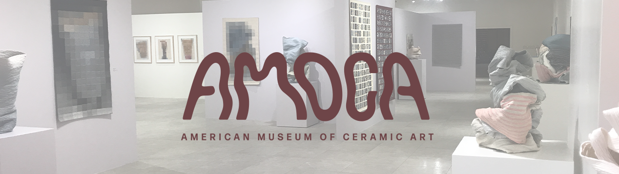
Specifications and Final Logo
We need your consent to load the translations
We use a third-party service to translate the website content that may collect data about your activity. Please review the details in the privacy policy and accept the service to view the translations.